Website Development
April 22, 2025
How to Make Your Broker’s Website Look More Credible and Convert Better
How to Make Your Broker’s Website Look More Credible and Convert Better
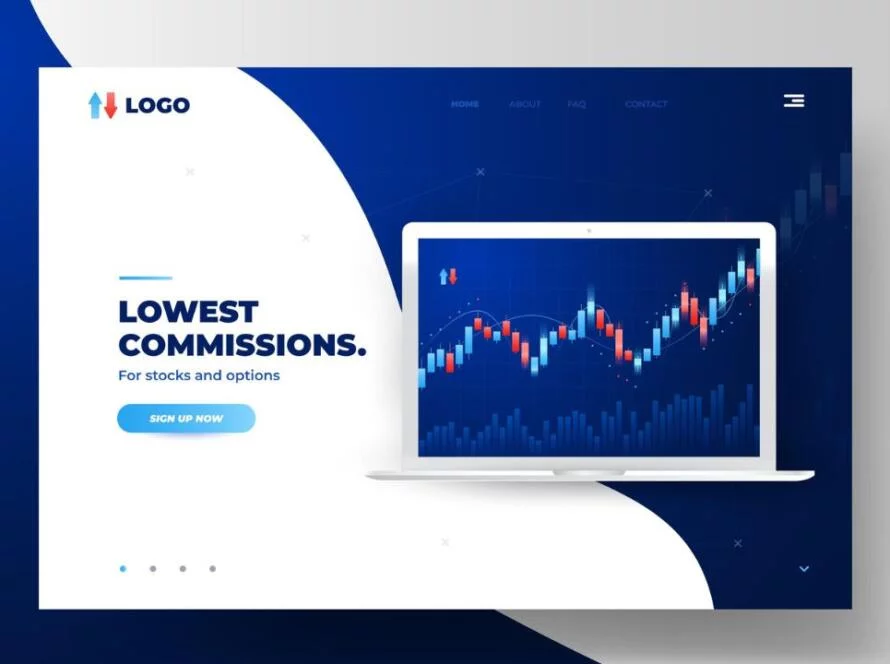
A clean and trustworthy broker website builds confidence, improves sign-ups, and shows traders that your platform is worth their money and attention.
How to Make Your Broker’s Website Look More Credible and Convert Better
A trader’s first impression of your brokerage doesn’t start with your spreads or asset list. It starts with your website. Before they ever open a live account or click “deposit,” they’ve already made one crucial decision:
Can I trust this platform with my money?
If your website looks outdated, cluttered, or just plain sketchy, the answer is often a quiet “no.” And they won’t say it to you—they’ll just close the tab.
That’s why your website isn’t just a technical asset—it’s your most important trust-building tool. A strong website builds credibility, creates confidence, and turns visitors into real users.
Here’s how brokers can get it right.
Your Website Reflects Your Credibility—Not Just Your Brand
When a trader lands on your site, they’re not just looking for product information. They’re looking for reasons to believe.
Your homepage, your signup process, your copy—all of it tells a story. A clean, modern layout says “We’re serious.” A confusing one says “We cut corners.”
And traders are sensitive to this. Especially if they’ve been burned before. If something looks shady, inconsistent, or incomplete, they’ll assume it applies to everything else too—your platform, your support, your withdrawals.
So if you're a broker trying to attract serious clients, the very first thing to audit is how your site feels.
Ask yourself:
Would I sign up here if I didn’t know the company?
Is it immediately clear what the broker offers?
Does the site make me feel secure and welcome?
If the answer isn’t a clear yes, it’s time to rebuild that first impression.
Trust Isn’t Claimed—It’s Shown
Every broker says they’re transparent, safe, and regulated. But traders are looking for proof, not slogans.
That proof starts with visible cues:
SSL encryption (that padlock symbol in the browser)
Upfront explanation of fees, spreads, and terms
Real-time support (like live chat)
Clear navigation to legal documents and regulation info
But it also includes human proof—things like:
Real testimonials from real traders
Public social media interaction (especially in places like X, Discord, or Telegram)
Transparent status on platforms like Trustpilot or community forums
If traders can’t find real people talking about your platform, they’ll assume no one uses it—or worse, that you’re hiding something.
In short: make your legitimacy visible, not buried.
A Clean Design Isn’t a Luxury—It’s a Signal
You don’t need fancy animations or flashy graphics. But your website does need to look intentional, updated, and easy to use.
Because when things look neglected, they feel risky. And in a market where trust is everything, risk isn’t a look you want to give off.
A strong broker site is:
Easy to navigate
Mobile-friendly
Optimized for fast loading
Written in clear, simple English (or local language, where applicable)
Traders don’t have patience for slow or clunky websites. And with so many brokers in the space, they really don’t have to settle.
A fast, intuitive site not only gives a better first impression—it makes conversion smoother. The signup button is obvious. The deposit flow is logical. And the confidence to “take the next step” grows naturally.
Your Site Should Explain Why You’re Worth It
Most traders aren’t comparing you to just one other broker. They’re comparing you to 5–10. And they’re doing it fast.
That means you need to clearly show:
What you offer
Why your pricing is fair
What makes your platform better or easier to use
How quickly people can start
Don’t assume traders will dig around to figure that out. Tell them. Boldly. High up on the page.
Instead of vague marketing jargon, use real numbers. Real tools. Real features. Real comparisons (where appropriate). And make sure the tone of voice feels like a person talking, not a robot writing legal copy.
If your competitors sound generic, that’s your chance to sound human and clear.
Security & Transparency: Non-Negotiables
No matter how attractive your offer is, if a trader doubts the safety of your platform, they won’t stay.
So let your website show:
What licenses or regulations you comply with
How client funds are protected or separated
What your payout and withdrawal process looks like
Where your team or company is located (even just a timezone helps humanize)
You don’t need to shout “WE’RE LEGIT” on every banner. You just need to make sure that anyone looking for reassurance can find it within seconds.
And if you do KYC, explain why. If there’s a fee, say it up front. If there’s a delay, say when it will resolve. That level of transparency buys long-term trust.
SEO & Marketing Only Work If the Site Converts
Let’s be clear: driving traffic to your site is only half the game. What matters more is what people do once they get there.
A high-converting broker site:
Has minimal friction on signup
Offers real-time or fast-response support
Makes the product experience feel seamless from the start
Doesn’t hide important info behind a registration wall
If you’re spending on paid ads, influencer content, SEO, or affiliate programs, make sure that your website actually deserves the traffic it gets.
That means checking conversion rates, heatmaps, bounce rates—and optimizing based on real user behavior.
Because no matter how good your marketing is, a weak website will quietly kill growth.
A Broker Website Is More Than a Landing Page—It’s a Funnel
Think of your website as more than just a place to showcase your brand. It’s the first step in the user journey—from curiosity, to sign-up, to deposit, to repeat client.
And just like any good funnel, it should:
Catch attention without overwhelming
Guide users smoothly through steps
Show value before asking for commitment
Give confidence to act
Whether you’re targeting retail traders, institutions, or niche audiences, your website needs to reflect their mindset. That takes real UX thinking—not just pretty design.
Put yourself in their shoes. What’s missing? What’s unclear? What’s slowing them down?
Fixing those things builds revenue—quietly but powerfully.
Final Thoughts: A Credible Broker Website Isn’t Just About Looks—It’s About Trust
Your spreads might be competitive. Your instruments might be diverse. But if your site doesn’t feel trustworthy, that effort won’t matter.
People don’t open live accounts with brokers they’re unsure about. They don’t deposit large amounts if something feels off. They don’t invite friends or return to trade again if their first impression was a mess.
But when your website looks and feels like it’s built by professionals—people stay longer, trade more, and refer others.
At GrowYourBroker, we specialize in turning outdated, underperforming broker websites into high-converting, trustworthy digital experiences. From UX design and copywriting to SEO, integrations, and affiliate flow—we help you make sure your first impression isn’t your last.
Let your site reflect the broker you truly are.
Work with GrowYourBroker and get a website that builds trust—and drives results.
About The Author
GrowYourBroker Team
At GrowYourBroker, we craft marketing strategies tailored for Brokers. We help boost visibility, attract skilled traders, and drive scalable growth. From new launches to established Brokers, our approach blends performance, branding, and funnels. We’re not just marketers — we’re your growth partners in the Broker trading.
Recent Posts